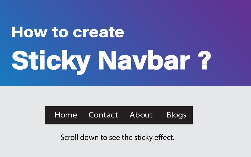
How to create sticky navbar in HTML & CSS
A sticky navbar is a popular design element used in web development to provide a better user experience. By keeping the navigation bar "sticky," or fixed to the top of the webpage, it remains visible as the user scrolls down, making it easier to navigate through the website. This feature is particularly useful for websites with a lot of content or pages.
By keeping the navigation bar "sticky," or fixed to the top of the webpage, it remains visible as the user scrolls down, making it easier to navigate through the website. This feature is particularly useful for websites with a lot of content or pages.
By implementing a sticky navbar using HTML, CSS, and JavaScript, web developers can create a more functional and user-friendly website that allows users to easily find what they are looking for. Overall, a sticky navbar is a simple yet effective way to improve the usability and functionality of a website.
How does a normal navbar work?
Before we dive into the implementation of a sticky navbar, it is important to understand how a normal navbar works. A navbar is typically placed at the top of a webpage and contains links to different sections of the website. When the user scrolls down the page, the navbar moves out of view and is replaced by the content of the webpage. This is the default behavior of a navbar.
What is a sticky navbar?
A sticky navbar, also known as a fixed navbar, is a design feature commonly used in web development. A sticky navbar is a navigation bar that remains visible at the top of the webpage, even as the user scrolls down. By keeping the navbar "sticky" or fixed in place, it ensures that the navigation bar is always accessible, which can greatly improve the user experience.
To make a navbar sticky, we need to add some JavaScript code to the webpage. The JavaScript code will add a class to the navbar when the user scrolls down the page, which will make the navbar sticky.
Step 1: Use HTML
The first step creates HTML Code for the navbar. The code of the navbar should be placed at the top of the webpage.
<nav>
  <ul>
    <li><a href="#">Home</a></li>
    <li><a href="#">About</a></li>
    <li><a href="#">Services</a></li>
    <li><a href="#">Contact</a></li>
  </ul>
</nav>
In this code, we have created a basic navbar with HTML. You can add more links and customize the HTML code to your needs.
Step 2: Use CSS
The next step adds CSS code in your file for styling the navbar. The CSS will determine the appearance of the navbar.
nav {
  position: fixed;
  top: 0;
  width: 100%;
  background-color: #333;
  color: #fff;
  padding: 20px;
}

nav ul {
  list-style: none;
  margin: 0;
  padding: 0;
  display: flex;
  justify-content: space-between;
}

nav ul li {
  margin: 0 10px;
}

nav ul li a {
  color: #fff;
  text-decoration: none;
}
Here, we have used CSS to set the position of the navbar to fixed, which makes it sticky. We have also set the background color and text color of the navbar. Additionally, we have added some padding to the navbar to create some space between the links.
Step 3: Use JavaScript
The final step in creating a sticky navbar is to add JavaScript code to the webpage. The JavaScript code will add a class to the navbar when the user scrolls down the page.
window.onscroll = function() {myFunction()};

var navbar = document.querySelector("nav");
var sticky = navbar.offsetTop;

function myFunction() {
  if (window.pageYOffset >= sticky) {
    navbar.classList.add("sticky")
  } else {
    navbar.classList.remove("sticky");
  }
}
Here, We have also set the offset top of the navbar to determine when the class should be added.
Step 4: Testing the code
After implementing all the steps, it's important to test the sticky navbar on different devices and browsers. This will ensure that the navbar works properly and is responsive to different screen sizes. If any issues are encountered, they can be refined and improved to create a better user experience.
You can test your code in this JsFeed Code Editor.
Here are some additional tips to help you create an effective sticky navbar:
- Keep the navbar simple and easy to use. Users should be able to easily navigate through the website using the navbar.
- Use contrasting colors to make the navbar stand out. This will make it easier for users to find and use the navbar.
- Consider adding a drop-down menu to the navbar. This is particularly useful for websites with a lot of content.
- Use CSS animations to make the navbar more engaging. This can be a subtle effect that makes the navbar more visually interesting.
- Use a responsive design that adapts to different screen sizes. This will ensure that the navbar is always visible and easy to use.
Overall, a sticky navbar is a great addition to any website. It makes it easier for users to navigate through the website and find the information they are looking for. By following the steps outlined in this article, you can create a sticky navbar that works well and provides a great user experience.
Thank You.

COMMENTS ( 0 )
Sign up to join the conversation
Add your feedback for Shuka Design’s project by signing in or signing up.